
Scroll to explore
Overview
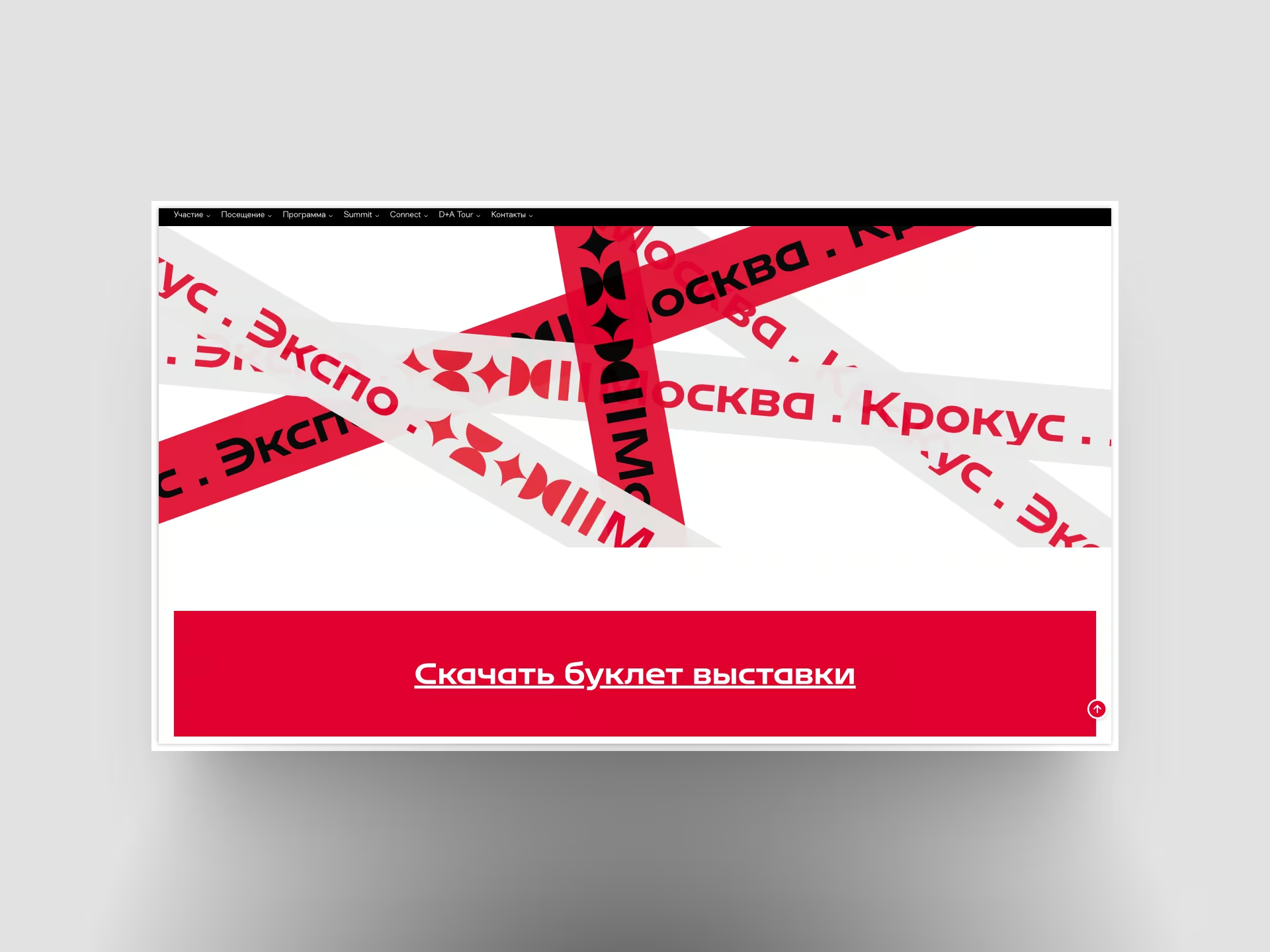
Mosbuild was launching into a competitive fintech market with a fragmented visual identity and no design system to speak of. We rebuilt their brand from the ground up — logo, colour, typography, motion — and codified everything into a scalable design system their product team could build on.
120+
Design tokens defined
3x
Faster design-to-dev handoff
2
Weeks to brand identity
Approach
Identity
Clarified voice, colour, and type so every touchpoint felt like one company, not a patchwork of old assets.
System
Tokens, grids, and components gave designers and developers a shared language and fewer one-off exceptions.
Handoff
Figma libraries and a Next.js starter cut design-to-dev time and made iteration the default workflow.
Challenge
Multiple agencies had touched the brand over the years, leaving inconsistencies across every surface. The product team was rebuilding the UI from scratch and needed a foundation they could rely on.
Solution
We started with a brand audit, then ran a two-week identity sprint. The resulting system — tokens, components, documentation — was handed off alongside a Figma library and a working Next.js component library.
Results
Mosbuild shipped a cohesive launch across web and product, with a system that scales as the team grows — fewer debates, faster shipping, and a brand that reads clearly in a crowded market.